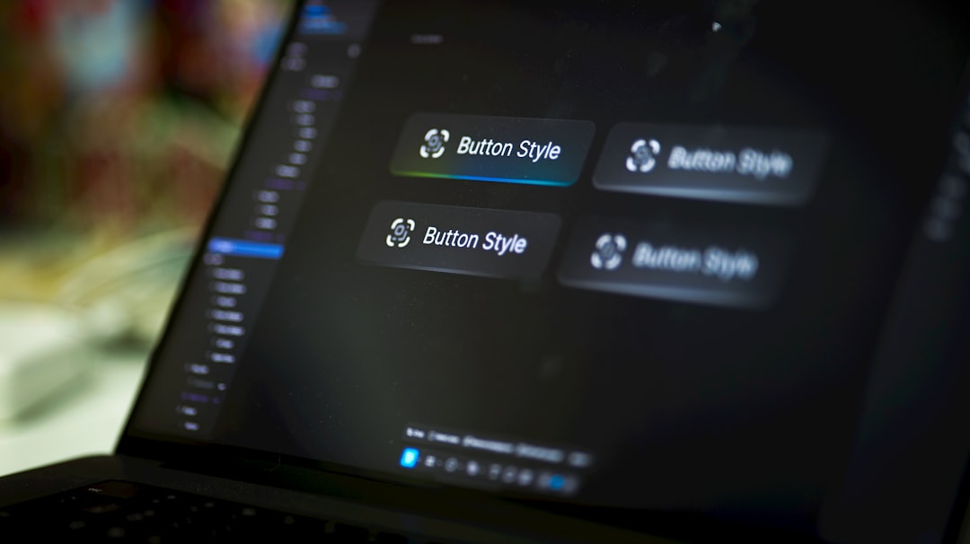
Table of Contents
Every click on your NYC small business website starts with a button. Whether it is a “Contact Us” link in your header, an “Add to Cart” control on a product page, or a “Book a Free Consultation” call to action at the bottom of your service page, buttons are the bridge between a curious visitor and a paying customer. Yet many Manhattan, Brooklyn, and Queens business owners treat buttons as an afterthought instead of a strategic conversion tool. Weak button design can quietly cost you inquiries, phone calls, and revenue every single day. The good news is that strong button design follows clear, testable principles. In this guide, we will walk through the button design best practices every NYC small business should apply so your website turns more visitors into paying customers.
Why Button Design Matters for NYC Businesses
Buttons are the most concentrated decision points on your website. According to research from the Nielsen Norman Group, users scan pages in F-shaped and Z-shaped patterns, looking for clear visual cues that tell them what to do next. Buttons are those cues. When a button is obvious, inviting, and clearly labeled, it pulls the visitor forward. When it is small, flat, or ambiguous, the visitor stalls, bounces, and moves on to a competitor.
For NYC small businesses, this matters even more. Manhattan users are often browsing on mobile devices while walking, commuting, or multitasking between meetings. They have limited patience for friction. A well-designed button on your homepage or service page can mean the difference between a booked consultation and a lost lead. Buttons also influence brand perception. Polished, consistent buttons signal a professional, trustworthy business. Inconsistent, poorly-styled buttons suggest that corners are cut elsewhere.
Finally, buttons drive measurable outcomes. Every major marketing platform, from Google Ads to Google Analytics, treats button clicks as conversion events. Improving your button design directly improves your cost per lead, bounce rate, and return on ad spend.
Size, Spacing, and Placement
The first rule of button design is simple: people have to be able to find and tap your button without thinking. That starts with size and spacing.
Minimum tap target size
Google’s web.dev accessibility guidance recommends a minimum tap target size of at least 48 by 48 CSS pixels, with at least 8 pixels of space around each target. Anything smaller forces users to squint, zoom, or tap multiple times. Desktop buttons can be a bit smaller, but on mobile, 44–56 pixels of height is a safe range.
Adequate white space
Buttons need breathing room. Cramming three buttons side by side in a tight row creates confusion and accidental clicks. Give every important button generous padding inside (12–18 pixels vertical, 24–32 pixels horizontal) and margin around it. For NYC service businesses, this whitespace also reinforces a premium, professional feel.
Strategic placement
The best button is useless if nobody sees it. Place your primary call to action above the fold on every key page, then repeat it at natural decision points further down. On a service page, that typically means one button near the top, one after your service overview, and one at the bottom after social proof. Learn more in our guide to above the fold design.
Color and Contrast That Converts
Color is the single most powerful visual signal on a button. The right color makes a button feel like a natural next step; the wrong color makes it blend into the background or, worse, fight with the rest of the page.
Use a distinct action color
Pick one brand accent color and reserve it almost exclusively for primary calls to action. If your brand palette is navy and gray, your orange, green, or teal accent becomes your “click here” color. When visitors see that color, their eye is trained to act. Secondary buttons can use a muted, outlined style so the hierarchy stays clear.
Meet contrast ratios
The W3C WCAG 2.1 guidelines require a minimum 4.5:1 contrast ratio between button text and background for standard text and 3:1 for large text. Light gray buttons with white text are a common violation. Use a free checker like WebAIM’s contrast tool to verify every button passes before launch. For more on building accessible color palettes, see our guide to choosing a color palette.
Avoid ghost buttons for primary actions
Transparent “ghost” buttons with thin outlines look elegant, but they consistently underperform solid buttons in A/B tests. For your most important NYC conversion — the contact form, quote request, or booking link — always use a solid, high-contrast button.
Button Hierarchy: Primary, Secondary, and Tertiary
Not every button on your page can shout for attention. Strong button design uses a deliberate hierarchy so visitors know which action is the most important. A well-designed NYC small business website typically has one primary button per screen, one or two secondary buttons, and any number of low-key tertiary text links.
Primary buttons
These are your money makers: “Get a Free Quote,” “Book a Consultation,” “Add to Cart.” Primary buttons should use your most saturated brand color with white or high-contrast text. They should be the single most visually dominant element within their section. Reserve this styling for the one action you most want a visitor to take on that page.
Secondary buttons
Use secondary buttons for meaningful but lower-priority actions like “Learn More,” “See Portfolio,” or “View Pricing.” A common pattern is a solid primary button next to an outlined or ghost secondary button in the same row. This visually pairs the two options while signaling which is preferred. On a Manhattan law firm site, for example, the primary might be “Schedule a Free Consultation” and the secondary might be “Read Case Studies.”
Tertiary links and micro-actions
Small utility actions like “Forgot password?” or “Download our brochure” can live as simple underlined text links or muted buttons. Styling these as loud primary buttons creates visual clutter and dilutes the impact of your real call to action. Treat every screen as a stage with one clear leading actor and a supporting cast. When visitors are not sure what to do, they often do nothing — and that silence costs you revenue.
Consistency across pages
Your primary, secondary, and tertiary button styles should look the same across every page of your website. Visitors learn your visual language quickly. A green “Book Now” button in the header should match the green “Book Now” button on the contact page. Inconsistency breeds hesitation. A simple design system with three reusable button styles keeps your site feeling cohesive and professional — an outcome every NYC small business should aim for. Learn more about our key features for NYC business websites.
Writing Button Copy That Drives Action
Button text is one of the highest-leverage microcopy choices you will ever make. A three-word change on a homepage button can lift conversions by double digits. The principle is simple: tell the visitor exactly what they will get or do next.
Start with a verb
“Submit” and “Send” are fine on a utility form, but your primary calls to action deserve stronger language. Use action verbs that describe the benefit: “Get My Free Quote,” “Book a Consultation,” “See Our Work,” “Start My Project.” Verb-led copy gives the visitor momentum.
Use first-person language
Research on conversion copywriting consistently shows that “Get My Free Estimate” outperforms “Get Your Free Estimate.” When the button speaks in the visitor’s voice, it feels like their own decision rather than a pushy sales pitch.
Keep it short and scannable
Most high-performing buttons are two to five words long. Any longer and the button starts to feel like a paragraph. If the offer needs more explanation, put the details in a small line of supporting text under the button, not on the button itself. For more on writing button text, see the Moz guide to descriptive anchor text, which applies equally to buttons and hyperlinks.
Button States: Hover, Focus, and Active
Great button design is not static. Buttons need to respond to user actions so visitors feel confident that the page is working.
Hover state
On desktop, hovering over a button should trigger a subtle visual change — a darker shade, a small shadow lift, or a gentle scale. This confirms the element is interactive. Avoid dramatic animations that distract from the copy.
Focus state
Focus states matter for keyboard users and accessibility. A visible outline or ring around the button when it is focused by tab navigation is required by WCAG. Do not remove focus outlines in your CSS without providing a visible alternative.
Active and disabled states
When a user clicks, briefly change the button appearance so they know the click registered. For forms that process submissions, show a loading state (“Sending…”) to reduce double-submissions. Disabled buttons should look visually distinct — usually a lower opacity and a “not-allowed” cursor.
Accessibility and Mobile Best Practices
More than half of NYC small business website traffic comes from mobile devices. Accessible, mobile-friendly button design is not optional — it is a legal and revenue imperative.
Use real button elements
Wrap your buttons in <button> or <a> tags, not generic <div> elements. This ensures screen readers announce them correctly and that keyboard users can tab to them. Review the Google Search Central technical docs for more on semantic HTML best practices that benefit both users and SEO.
Thumb-friendly zones
On mobile, place primary buttons in the middle or bottom of the viewport where thumbs naturally rest. Avoid locating critical calls to action in the top-right corner, which is the hardest area to reach on large phones.
Test on real devices
Emulators only go so far. Test every primary button on an actual iPhone and Android device, at different text-size settings, and in both portrait and landscape. For guidance on mobile-first design, our post on mobile-first design goes deeper.
Key Takeaways
Buttons are the conversion engine of your NYC small business website. Make them big enough to tap easily — at least 48 pixels tall on mobile — with generous spacing and strategic placement above the fold. Use one distinct brand accent color for primary actions and meet WCAG 4.5:1 contrast minimums. Write action-oriented, first-person copy like “Get My Free Quote” instead of weak labels like “Submit.” Add clear hover, focus, and loading states so every interaction feels responsive. Test on real mobile devices, not just emulators. Small, consistent improvements to your button design compound into meaningful gains in inquiries, bookings, and revenue over time.
Ready to Improve Your Website’s Buttons?
IL WebDesign builds high-converting websites for small businesses across Manhattan, Brooklyn, and Queens. We audit button design, color, copy, and accessibility as part of every project so your site works harder for you.
References
- Nielsen Norman Group — How users read on the web and why scannability matters.
- web.dev — Accessible tap target size guidance for mobile.
- W3C WCAG 2.1 — Contrast requirements for accessible UI design.
- Moz Learn SEO — Descriptive anchor text and internal linking best practices.
Irwin
Founder of IL WebDesign, a NYC-based web design agency specializing in high-performance websites for small businesses. With years of experience in web development, SEO, and digital strategy, Irwin helps local businesses establish a powerful online presence that drives real results.