build trust with your website design for NYC small businesses — IL WebDesign Manhattan

Above the Fold: What It Is and Why It Matters for Your NYC Business Website

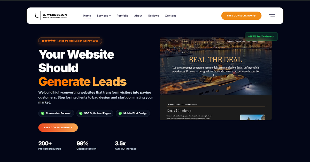
For NYC small businesses competing in one of the world’s most crowded digital marketplaces, every pixel of your website counts — but none more than what appears before a visitor ever scrolls. This prime real estate is known as “above the fold,” and it can make or break your first impression. In Manhattan, Brooklyn, and Queens, where potential customers are comparing dozens of businesses in seconds, the content you place above the fold directly determines whether visitors stay to learn more or bounce to a competitor. Understanding what above the fold means, why it matters, and how to optimize it is one of the most impactful investments you can make in your web presence. In this guide, we’ll break down everything NYC small business owners need to know about above the fold design. What Does “Above the Fold” Mean in Web Design? The term “above the fold” originates from print newspapers, where editors placed the most important headlines on the upper half of the front page — the half visible to passersby before unfolding the paper. In web design, above the fold refers to the portion of a webpage that is visible to a visitor without scrolling when they first land on it. Because screen sizes vary dramatically — from large desktop monitors to small smartphone screens — the exact boundary of “above the fold” shifts depending on the device. On a typical desktop screen (1366×768 pixels), above the fold includes roughly the top 600–700 pixels. On a mobile device, that window may shrink to just 400–500 pixels. This variability makes it critical that your above-the-fold design performs well across all screen sizes, using responsive design principles to ensure the experience is optimized everywhere. The Fold in a Mobile-First World With Google’s mobile-first indexing now the standard, your above-the-fold content must be optimized for smartphones above all else. Studies from the Nielsen Norman Group consistently show that users spend the vast majority of their time looking at content above the fold, with attention dropping sharply below it. For NYC businesses targeting busy, on-the-go customers browsing on their phones, the fold has never been more important. The content that loads first, displays clearly, and communicates value instantly is what determines whether a potential customer engages or exits. Why Above the Fold Content Matters for User Engagement Your above-the-fold section is essentially your digital storefront window. Just as a physical storefront in SoHo or Midtown Manhattan needs to attract passersby with compelling window displays, your website’s above-the-fold content must immediately communicate who you are, what you offer, and why a visitor should care. The stakes are high — and in a market as competitive as New York City, there’s no room for a weak first impression. Research from the Nielsen Norman Group shows that users form a first impression of a website in approximately 50 milliseconds. That initial judgment — largely subconscious — determines whether they’ll engage further. If your above-the-fold section is cluttered, confusing, or fails to communicate value, visitors will leave before they ever see your services, testimonials, or contact information. Impact on Bounce Rates and Conversions A poorly designed above-the-fold section leads to high bounce rates, which negatively impacts both your Google rankings and your bottom line. Conversely, a strong above-the-fold experience that clearly communicates your value proposition and guides users toward a next step — whether that’s calling your business, booking a consultation, or reading more — can dramatically improve conversion rates. For a Manhattan restaurant, law firm, or retail shop, that difference can translate directly into revenue and long-term customer relationships. SEO Implications Search engines like Google use engagement signals — including time on site, bounce rate, and pages per session — as indirect ranking factors. When your above-the-fold content hooks visitors and encourages them to explore further, it sends positive signals to Google. According to Google Search Central, creating helpful, people-first content that satisfies user intent is foundational to strong search performance. A compelling above-the-fold section is where that user intent satisfaction begins. Key Elements Every NYC Business Should Include Above the Fold Not all above-the-fold sections are created equal. The most effective ones include a carefully chosen set of elements that immediately orient visitors and motivate action. Here’s what your NYC business website should prioritize in its above-the-fold layout: A Clear, Benefit-Driven Headline Your headline is the first thing visitors read. It should immediately communicate the core benefit your business provides — not just what you do, but how you help. Instead of “Manhattan Web Design Agency,” try “We Build Websites That Win More Customers for NYC Businesses.” This customer-focused framing speaks directly to what visitors care about most and immediately answers the question: “What’s in it for me?” A Supporting Subheadline Your subheadline should add context and specificity to the main headline. It’s your chance to mention your location, specialization, or key differentiator. For example: “Custom, mobile-optimized websites for restaurants, law firms, and retail shops in Manhattan, Brooklyn, and Queens — designed to convert visitors into paying customers.” A strong subheadline reinforces the headline’s promise and gives visitors more reason to stay. A Strong Call to Action (CTA) Every above-the-fold section needs at least one clear, prominent CTA button. Research from web.dev reinforces that user-centric design with fast, clear, actionable interfaces directly improves core web vitals and engagement. Your CTA should be action-oriented (“Get a Free Quote,” “Schedule a Consultation,” “Call Us Today”) and visually distinct from surrounding content through color contrast and size. A Compelling Hero Image or Visual A high-quality image or video that reflects your brand, services, or team helps build trust and make your site feel professional. For NYC businesses, authentic local imagery — your actual storefront, your team at work, or recognizable NYC landmarks — can create an immediate connection with local visitors. Avoid generic stock photos that feel impersonal and fail to differentiate your brand. Social Proof Indicators If space allows, subtle trust signals above the fold — such as star ratings, a line like “Trusted by
black laptop computer on white textile — IL WebDesign Manhattan

Above the Fold: 5 Proven Tips Every NYC Business Website Needs

Above the fold is one of the most critical concepts in web design for NYC small businesses. If you run a business in Manhattan or anywhere across NYC, your website is often the very first impression potential customers will have of you. And within that first impression, the most important piece of real estate on your entire site is what users see before they ever scroll. This is called the “above the fold” area — and getting it right can mean the difference between a visitor becoming a paying customer or clicking away within seconds. Understanding what above the fold means, what it should contain, and how to design it effectively is essential for any small business owner looking to improve their website’s performance, conversions, and local SEO rankings in a highly competitive market like New York City. What Does “Above the Fold” Mean in Web Design? The term “above the fold” originated in the newspaper publishing industry. When papers were folded in half and stacked on newsstands, only the top half of the front page was visible to passersby. Editors and publishers placed the most critical headlines, photographs, and stories in that top section to grab attention and drive sales — because no one would turn the paper over unless something in the top half convinced them it was worth reading. The same principle applies directly to your website. In web design, “above the fold” refers to the portion of a webpage that is immediately visible to the user without requiring any scrolling. The exact dimensions vary based on screen size, device type, browser settings, and screen resolution — but the concept remains constant: it is what your visitor sees first, instantly, and without any effort on their part. For most desktop screens, this is roughly the top 600–800 pixels of your page. On mobile devices, which have smaller viewports and often display only 400–500 pixels of visible content, the challenge becomes even more significant. For NYC small businesses competing in a crowded digital marketplace — where dozens of competitors are just a search result away — every single pixel in this zone must work hard for you. Why Above the Fold Content Is Critical for NYC Small Businesses Research from Nielsen Norman Group shows that users spend about 57% of their page-viewing time above the fold. That means the majority of your visitor’s focused attention is concentrated in the very first thing they see when your page loads. If your above the fold content fails to immediately communicate who you are, what you offer, and why it matters to the visitor, you lose that opportunity — and likely, that customer. For small businesses in Brooklyn, Queens, and Manhattan, this reality is especially important. Local service businesses — plumbers, lawyers, accountants, web designers, healthcare providers, financial advisors — face intense local competition online. A slow-loading, confusing, or generic homepage will send potential clients straight to a competitor. Your above the fold section must instantly communicate your value proposition with clarity and confidence. First Impressions Are Formed Almost Instantly Research has shown that users form a visual opinion about your website in as little as 50 milliseconds. That means your headline, imagery, color scheme, and overall layout must immediately signal trustworthiness, professionalism, and relevance — before a single word is read. A cluttered or generic above the fold section can destroy credibility faster than any negative review. For NYC businesses, where competition is fierce and consumers are sophisticated, first impressions are everything. The Fold Directly Affects Bounce Rate and Conversions If visitors cannot quickly determine what you offer and why they should stay on your site, they will bounce. Google uses behavioral signals — including bounce rate, time on page, and scroll depth — as indirect quality signals in its ranking algorithm. A well-optimized above the fold area keeps visitors engaged and scrolling, which benefits both conversion rates and long-term SEO performance. Higher engagement means lower bounce rates, more time on site, and better signals to search engines that your page is relevant and valuable. Key Elements Every Above the Fold Section Should Include Designing an effective above the fold section requires intentional, strategic decisions about what to include — and what to leave out. Based on NNGroup research on page design principles, the most effective hero sections for small business websites share a set of common high-performing elements. A Clear, Compelling Headline Your headline is the single most important element in the above the fold area. It should immediately communicate what your business does and who it serves. Avoid vague taglines like “Welcome to Our Website” or “Excellence in Service.” Instead, lead with a direct, specific value statement: “Expert Web Design for NYC Small Businesses” or “Manhattan’s Trusted Local SEO Agency.” The headline should naturally incorporate your primary keyword and speak directly to your target customer’s most pressing need or desire. A Strong Subheadline or Supporting Statement Directly beneath the headline, a supporting line adds context and reinforces your core value proposition. This is where you can introduce specific benefits, your geographic service area, or your unique differentiator. For example: “We help Brooklyn and Manhattan businesses build websites that attract local customers and grow consistent revenue.” Keep it concise — one to two sentences — and make it about the customer’s outcome, not just your services. A Clear and Prominent Call to Action (CTA) Every above the fold section must have one primary call to action. This might be “Get a Free Consultation,” “Request a Quote,” “Schedule a Call Today,” or “Call Us Now.” According to web.dev UI design principles, a single, prominent CTA consistently outperforms pages with multiple competing buttons. Use a contrasting button color that stands out from your background, make the button large enough to be easily tappable on mobile, and use action-oriented language that emphasizes the benefit to the visitor. A Relevant Hero Image or Visual Element The visual element in your above the fold section sets the emotional tone for the entire page
graphical user interface, website — IL WebDesign Manhattan

The Importance of Website Navigation Structure

Every successful business website has one thing in common: users can find what they need without friction. For NYC small businesses competing in one of the world’s most competitive markets, your website navigation structure is not a design afterthought — it’s a strategic business asset. From the moment a potential customer arrives on your site, your navigation system either guides them toward a phone call, a form submission, or a purchase — or it drives them away. In this guide, IL WebDesign breaks down exactly what makes great website navigation, how it impacts your Google rankings, and what mistakes Manhattan and Brooklyn businesses should avoid when structuring their menus. What Is Website Navigation and Why Does It Matter for NYC Businesses? When visitors land on your website, one of the first things they instinctively do is scan for a way to get around. Website navigation is the system of menus, links, and pathways that helps users find information quickly and efficiently. For NYC small businesses — whether you’re a law firm in Midtown Manhattan, a restaurant in Brooklyn, or a boutique in Queens — your navigation structure can mean the difference between a converted customer and a frustrated visitor who bounces within seconds. Poor navigation is one of the leading causes of high bounce rates. If someone can’t find what they’re looking for within two or three seconds, they’ll leave — and likely head straight to a competitor. Research from the Nielsen Norman Group shows that users form impressions of websites extremely quickly, and first impressions are heavily influenced by how easy it is to navigate. Meeting user expectations starts with intuitive, well-organized navigation. Beyond user experience, navigation directly affects how search engines like Google crawl and index your site. A logical, well-planned navigation hierarchy can improve your rankings for local NYC search terms, while a disorganized menu can cause key pages to go unindexed — effectively invisible to potential customers. The Main Types of Website Navigation Understanding the different types of navigation helps you make informed decisions about your website’s structure. Each type serves a distinct purpose, and together they create a cohesive, user-friendly experience. Primary Navigation (Main Menu) Your primary navigation is the main menu, typically displayed in the header of your website. It should contain your most important pages: Home, About, Services, Portfolio, and Contact. For most NYC small businesses, a clean horizontal navigation bar with 5–7 links is the gold standard. Cluttered menus confuse users and dilute the impact of each individual page. According to the Nielsen Norman Group, keeping primary menus to 7 items or fewer reduces cognitive load and significantly improves usability scores. Secondary Navigation (Footer and Sidebar) Secondary navigation in the footer or sidebar supports the primary menu by providing additional links — legal pages, social media profiles, sitemap links, or service subcategories. Footer navigation is especially useful for users who scroll to the bottom looking for contact details or policy information. While it carries less SEO weight than your main menu, it meaningfully improves the overall user experience and provides an additional crawling pathway for search engines. Breadcrumb Navigation Breadcrumbs show users exactly where they are within your site hierarchy. For businesses with many subcategories — such as multi-service agencies, legal firms with practice areas, or e-commerce sites — breadcrumbs reduce confusion and reinforce your site’s logical structure. Google also uses breadcrumbs to understand your page hierarchy, which can positively impact how your pages appear in search results. Learn more at Google Search Central: Breadcrumb Structured Data. Hamburger Menu (Mobile Navigation) On mobile devices, a hamburger menu — the three-line icon that reveals a hidden menu when tapped — has become the standard. For NYC small businesses where a large percentage of visitors come from smartphones, the hamburger menu needs to open smoothly, load quickly, and present all key navigation items clearly. Poor mobile navigation is a top reason for mobile bounce rates, which directly impacts Google rankings under mobile-first indexing. How Navigation Structure Affects SEO Your website’s navigation structure isn’t just a UX consideration — it has a direct and measurable impact on your search engine rankings. Google’s crawlers follow links to discover and index your pages. A clear, logical navigation hierarchy helps search engines understand which pages are most important and how they relate to one another. When your main navigation links to key service pages, you’re signaling to Google that those pages are high-priority. This transfers what SEO professionals call “link equity” — the authority passed through internal links. A disorganized navigation with broken links, circular redirects, or orphaned pages (pages with no inbound internal links) can confuse crawlers and prevent your most important content from ranking. For more on how Google processes site structure, see Google Search Central: Crawlable Links. Site Architecture and Crawl Depth A flat site architecture — where every important page is reachable within 3 clicks from the homepage — is considered best practice. Deep architectures, where key pages are buried 5 or 6 levels down, reduce their crawlability and perceived importance. For Manhattan businesses targeting local search terms like “web design NYC” or “Manhattan attorney,” ensuring your core service pages are easily accessible from the homepage is critical to local SEO performance. Additionally, pages that receive internal links from navigation menus get crawled more frequently than those linked only from deep within blog posts. This is why navigation placement matters so much for the pages you want to rank. Navigation Best Practices for NYC Small Business Websites Following established navigation best practices can dramatically improve both user experience and search performance. These principles are backed by UX research and applied by high-performing websites across all industries. Use Descriptive, Keyword-Rich Labels Instead of labeling a menu item simply “Services,” consider more specific labels like “Web Design NYC” or “Manhattan SEO Services.” Descriptive labels help users instantly understand what to expect on the destination page, and they give Google additional keyword context. Avoid vague terms like “Solutions,” “Offerings,” or “What We Do” — these leave
Laptop, phone, plant, and a rustic pencil. — IL WebDesign Manhattan

How to Choose the Right Color Palette for Your Business Website

When a potential customer lands on your website, they form an opinion about your business within milliseconds — and color plays a massive role in that first impression. For small businesses in Manhattan and across New York City, where competition is fierce and every detail matters, choosing the right color palette for your website isn’t just a design decision — it’s a business strategy. The right colors communicate your brand values, build trust, and drive conversions. The wrong ones can push visitors away before they’ve even read a single word. In this guide, we’ll walk you through the process of selecting a color palette that works for your brand, your audience, and your NYC market. Why Color Matters More Than You Think The Psychology of Color in Branding Color psychology is the study of how hues affect human behavior and emotion. Research has consistently shown that people associate specific feelings and qualities with particular colors. Blue evokes trust, reliability, and professionalism — which is why it’s widely used by financial institutions and tech companies. Red communicates energy, urgency, and passion, making it popular for food brands and retailers. Green is associated with health, nature, and growth, while yellow projects optimism and warmth. For NYC businesses, understanding these associations can mean the difference between a website that resonates with your target audience and one that confuses or alienates them. The colors you choose become the visual language of your brand — they speak before your copy does. Research from the Nielsen Norman Group consistently shows that visual design, including color, is one of the most powerful drivers of user trust online. First Impressions Are Made in Milliseconds Studies show that users make snap judgments about websites almost instantly — often in less than 50 milliseconds. A poorly chosen color scheme — clashing hues, hard-to-read contrasts, or colors misaligned with your industry — can cause visitors to distrust your business and leave your site without engaging. In a city like New York, where your competitors are often just a Google search away, you cannot afford to lose customers to a bad first impression. A cohesive, well-thought-out color palette signals professionalism, attention to detail, and a clear brand identity — all qualities that NYC consumers value and expect. According to Google’s research on page experience, visual polish directly correlates with user engagement and time on site. Understanding the Basics of Color Theory Primary, Secondary, and Tertiary Colors Before you can choose the right palette for your website, it helps to understand the fundamentals of color theory. The color wheel is divided into primary colors (red, blue, yellow), secondary colors created by mixing primaries (orange, green, purple), and tertiary colors that blend primary and secondary hues. This foundational knowledge helps you understand why some color combinations feel harmonious while others feel jarring. When building your website palette, you’ll typically draw from one dominant color — often called your “hero” or “brand” color — and pair it with complementary or analogous hues that create visual balance without competing for attention. Strong web design always begins with a solid understanding of how colors relate to one another, not just how they look in isolation. Color Relationships: Complementary, Analogous, and Triadic Professional designers rely on established color relationships to create visually appealing palettes. Complementary colors sit directly opposite each other on the color wheel (such as blue and orange), creating high contrast and visual energy — great for CTAs and buttons. Analogous colors sit next to each other on the wheel (like blue, blue-green, and green) and create a harmonious, calming effect. Triadic palettes use three evenly spaced colors and offer vibrant variety without the tension of direct complements. For most small business websites, a combination of one primary brand color, one accent color, and two to three neutral tones (white, light gray, dark gray, or black) provides the right balance of cohesion and visual interest. The W3C’s web accessibility guidelines also provide essential context for how color combinations perform in real-world use. How to Define Your Brand’s Color Identity Know Your Industry and Audience The right color palette for your website depends heavily on who your customers are and what industry you operate in. A law firm in Midtown Manhattan will have very different color needs than a Brooklyn-based yoga studio or a Queens restaurant. Professional services businesses — lawyers, accountants, consultants — typically benefit from authoritative, trustworthy palettes: navy blues, deep grays, and whites. Creative agencies and design studios often use bold, unconventional palettes to demonstrate their creativity. Health and wellness businesses gravitate toward greens, teals, and soft blues. Restaurants and food businesses might lean into warm reds, oranges, and earthy tones. Before you open a color picker, research the demographics, preferences, and expectations of your target customers in the NYC market. Tools like Google Trends and Think with Google can help you understand how your audience engages with brands visually. Study Your Competition (Without Copying Them) One of the most effective exercises before finalizing your color palette is to audit your competitors’ websites. Take note of the dominant colors they’re using. Are all the law firms in your area using navy blue? That tells you something important: navy blue communicates trustworthiness in your industry. But it also presents an opportunity — a well-executed palette that still conveys professionalism while differentiating your brand can help you stand out. The goal isn’t to copy what’s working for competitors, but to understand the visual conventions of your industry and make a deliberate, informed decision about whether to follow them or strategically differentiate from them. Differentiation through color, when done thoughtfully, can be a genuine competitive advantage in a crowded NYC market. Building Your Color Palette Step by Step Start With One Hero Color Every strong website color palette begins with a single hero or anchor color — the one that best represents your brand personality and will appear most prominently across your site. This is typically the color used in your logo, if you have one.
MacBook Pro on top of brown wooden table during daytime — IL WebDesign Manhattan

Why Your Business Website Needs a Clear CTA on Every Page

A strong website call-to-action on every page is the key to turning visitors into customers. Your website is your most powerful sales tool — but only if it guides visitors toward taking action. For NYC small businesses competing in Manhattan’s fast-paced marketplace, a well-placed call-to-action (CTA) can be the difference between a visitor who simply browses and one who becomes a paying customer. Yet many business websites fail at this fundamental principle: every page should tell visitors exactly what to do next. Whether your website call-to-action strategy is clear or not can make or break your results. Whether you run a restaurant in the East Village, a law firm on Fifth Avenue, or a boutique in SoHo, your website’s CTAs are the bridge between visitor interest and measurable conversions. In this guide, we’ll explore why CTAs matter, what makes them effective, and how NYC small businesses can use them strategically on every page of their website to drive real results. What Is a Website Call-to-Action and Why Does It Matter? A call-to-action (CTA) is a prompt that encourages your website visitors to take a specific, intended step. It can be a button, a link, a form, or even a line of persuasive text. Common examples include “Schedule a Free Consultation,” “Get a Quote Today,” “Call Us Now,” or “Shop the Collection.” On the surface, a CTA might seem like a minor design element — but in reality, it is the engine that drives conversions on your website. Without clear CTAs, visitors are left to make their own decisions about what to do next, and most of the time they’ll simply leave. Research from the Nielsen Norman Group consistently shows that users scan pages quickly and need clear visual cues to guide their journey. When a visitor lands on your site, they are asking one unconscious question: “What should I do here?” If your page doesn’t answer that question within seconds, you’ve lost them. CTAs Turn Passive Visitors Into Active Leads Every page on your website has a purpose — whether it’s to inform, build trust, or drive a purchase. A CTA aligns that purpose with an action. A Services page without a CTA simply describes what you do. A Services page with a strong CTA — “Ready to get started? Contact us for a free quote” — converts curiosity into a business opportunity. For Manhattan businesses where every click counts, this distinction is critical. The Psychology Behind Effective CTAs Understanding why CTAs work means understanding a bit of human psychology. When visitors come to your website, they are often in a problem-solving mindset. They need something — a product, a service, an answer. A well-crafted CTA meets them in that moment and provides a clear path forward. It reduces decision fatigue by eliminating ambiguity: there is one clear next step, and it is easy to take. Color, placement, and language all play a role in a CTA’s effectiveness. Studies from web usability researchers at the Nielsen Norman Group have found that high-contrast buttons placed above the fold and repeated at natural stopping points throughout the page dramatically increase click rates. But psychology goes beyond visuals. The words you choose matter enormously. Action-Oriented Language Drives Clicks CTAs that begin with a strong verb — “Get,” “Start,” “Discover,” “Book,” “Request” — perform better than passive phrasing. “Learn More” is weak; “See How We Helped 50+ NYC Businesses” is compelling. When you add a benefit statement to your CTA (“Get Your Free Website Audit — No Obligation”), you’re giving visitors a reason to act, not just a command to follow. For NYC small businesses, adding local relevance (“Serving Manhattan & Brooklyn”) can also increase trust and conversion rates. Urgency and scarcity, used honestly, can also enhance CTA performance. “Limited spots available this month” or “Schedule before Friday for a free bonus audit” creates a natural motivation to act now rather than later. Which Pages Need a CTA — and What Kind? Every page on your website should have at least one CTA — but not every CTA needs to be the same. Matching the CTA to the visitor’s intent on that specific page is the key to maximizing conversions. Here’s how to think about CTAs by page type: Homepage Your homepage CTA should be your primary conversion goal. For most NYC service businesses, that means booking a consultation, requesting a quote, or calling your office. Make it prominent, place it above the fold, and repeat it lower on the page. A secondary CTA — “View Our Portfolio” or “Learn About Our Services” — can guide visitors who aren’t ready to commit yet. Service Pages Each individual service page should have a CTA specific to that service. If you’re a Brooklyn plumber with a page on drain cleaning, the CTA should say something like “Schedule Drain Cleaning Today — Same Day Service Available.” This specificity dramatically outperforms generic CTAs like “Contact Us.” About Page Your About page builds trust, so your CTA here should leverage that trust. “Meet our team — let’s talk about your project” or “We’d love to learn about your business. Get in touch” are warm, relationship-focused CTAs that fit the context of the page. Many NYC businesses overlook this and leave their About pages with no CTA at all — a major missed opportunity. Blog Posts Blog posts attract top-of-funnel visitors who are in research mode. Your CTA here should offer additional value: “Download our free NYC SEO checklist,” “Subscribe for weekly web tips,” or “Wondering how this applies to your business? Get a free consultation.” Blog CTAs nurture visitors toward becoming clients over time. Common CTA Mistakes NYC Businesses Make Even well-intentioned CTAs can underperform if they fall into common traps. Here are the mistakes we see most frequently when auditing small business websites in New York City: Too Many CTAs Competing for Attention When every button on a page shouts for attention equally, visitors experience choice paralysis and take no action at all. Each page should have
black and silver laptop computer on green table — IL WebDesign Manhattan

How to Design a Contact Page That Gets More Inquiries

Effective contact page design is the difference between a website that generates inquiries and one that doesn’t. >For NYC small business owners, every missed inquiry is a missed opportunity. Your contact page is one of the most strategically important pages on your entire website — it’s where potential customers go when they’re finally ready to take action. Yet most businesses treat it as an afterthought, dropping in a generic form with minimal thought given to design, copy, or user experience. A well-designed contact page can dramatically increase the number of inquiries you receive. For Manhattan and Brooklyn businesses competing in a dense marketplace, the difference between a high-converting contact page and a mediocre one can mean dozens of additional new leads every single month. In this guide, we walk through the essential design principles that turn casual visitors into paying customers and show you exactly how to build a contact page that works hard for your NYC business. Why Your Contact Page Is a Sales Tool, Not Just a Form Most small business websites treat their contact page as a mere formality — a place to drop a phone number and an email address and move on. But your contact page is actually one of the most high-intent pages on your entire site. Visitors who reach your contact page have already expressed real interest in your services. They’ve browsed your offerings, read about your company, and made a conscious decision to reach out. At this critical moment, friction — any obstacle or uncertainty — will cause them to leave without submitting an inquiry. Research from the Nielsen Norman Group consistently shows that users form quick judgments about a website’s credibility. If your contact page feels complex, impersonal, or cluttered, it undermines the trust you’ve worked to build everywhere else on the site. For NYC businesses — especially those in competitive industries like web design, legal services, real estate, and consulting — a polished contact page communicates professionalism and signals that your business is organized, responsive, and worth working with. Think of your contact page as the final moment in a sales conversation. Your job is to remove every possible barrier between the visitor and the moment they decide to reach out. That means clear design, simple and direct language, and a frictionless form experience. When you get this right, you’ll see your inquiry rate climb without spending a single additional dollar on advertising or marketing. Treat your contact page as a direct revenue driver, not just a necessary page to include on your site. The Essential Elements Every Contact Page Needs A Short, Simple Contact Form The most common mistake on contact pages is asking for too much information upfront. Research from user experience experts consistently shows that shorter forms produce significantly higher completion rates. For most NYC small businesses, three to four fields are all you need: full name, email address or phone number, and a brief message or inquiry type. Avoid asking for budget ranges, project timelines, or detailed project specifications on the initial contact form. You’ll gather that information during the follow-up conversation. The sole goal of the form is to start the dialogue and make it as easy as possible for the visitor to take that first step toward becoming your client. Multiple Ways to Get in Touch Not every visitor wants to fill out a form. Some prefer to call, others like to email directly, and many local clients — especially in Manhattan — want to confirm your physical location before reaching out. Your contact page should offer several options: a contact form, a clickable phone number, a direct email address, and your business address with hours. For businesses with a physical location in New York City, embedding a Google Maps widget is especially valuable. Local customers want to know you’re genuinely nearby, and a map builds confidence that you’re an established business operating in their community. Giving visitors options respects their preferences and removes a major barrier to contact. Hours of Availability and Response Time Show visitors when they can expect a response. Whether you’re a solo consultant or a small team, clearly state your business hours and your typical response time. A simple statement like “We respond to all inquiries within 1 business day, Monday through Friday” can measurably increase form submissions. It removes one of the biggest sources of visitor anxiety — the uncertainty about whether anyone will actually respond. Setting expectations upfront is one of the simplest and highest-impact improvements any NYC business can make to their contact page, and it costs nothing to implement. Design Principles That Boost Conversions Prioritize White Space A cluttered contact page is an overwhelming contact page. Web design best practices from sources like the W3C and leading UX researchers consistently support the use of generous white space on high-conversion pages. White space directs focus, reduces cognitive load, and makes your form feel approachable and professional. Resist the urge to fill every section of the page with text, images, or promotional offers. On your contact page, less is genuinely more. Give the form plenty of room to breathe, and let the visitor focus entirely on the single action you want them to take. Every extra element you add to the page competes for attention with your form. Write a Specific, Action-Oriented CTA Button The text on your form’s submit button matters more than most business owners realize. Generic labels like “Submit” or “Send” consistently underperform compared to specific, action-oriented alternatives. Try language such as “Get My Free Consultation,” “Let’s Talk About Your Project,” or “Start My Website Today.” The button label should describe the value the visitor receives when they click — not the action you’re asking them to perform. This small but powerful change can produce a measurable lift in your form conversion rate without requiring any technical changes to your site’s structure or design. Design for Mobile First More than half of all web traffic now comes from mobile devices, and this is

IL Webdesign is a dynamic digital agency specializing in creating bespoke websites, strategic SEO, and impactful social media marketing to propel businesses forward in the digital landscape.

Contact Us